
01 / 06
Hospitality
Nine feet of run carrying a portrait screen. Vertical suits what people read while they are walking past: a schedule, a directory, room status, a welcome. And a portrait face is narrow enough to sit inside a standard module, so it fits the run rather than widening it.

Media Hub is the same idea in landscape, and it costs a run six extra inches: a forty-three inch screen lying down has a thirty-eight inch face, wider than a module, so its column has to build at forty-two rather than thirty-six. A portrait face is narrow by definition. At thirty-two inches it measures sixteen across and twenty-eight tall, which drops into a standard module with room either side and spans exactly two tiers. Three columns come to a clean hundred and eight inches, and nothing about the case has to change to hold it.
That is the whole argument for portrait, and it is not only about the case. In a commercial interior a vertical screen suits the things people take in on their feet: a class schedule, a floor directory, room status, a welcome. Those want a tall column of legible lines, not a wide one, so a smaller screen turned upright does the job a larger one lying down would do worse. Landscape is for sitting down to watch something. Choose the orientation by what the screen is for, and the size and the run both follow.
03
Elevation
Digital signage casework drawn to scale. Hover or tab any bay for its treatment and finish, and switch faces to see what the other side of the same run gets.

| Tier | Configuration | Finish |
|---|---|---|
| Row 1 58–76″ |
Open shelf at columns one and three. A full back panel at column two, directly above the display, so nothing reads as floating over the screen. | Walnut Ember Grigio Aragona |
| Row 2 40–58″ |
The display at column two. A center divider with a full back at column one. Open shelf at column three. | Walnut Ember City Grey |
| Row 3 22–40″ |
The display continues at column two. Open shelf at column one. A center divider with a full back at column three. | Walnut Ember City Grey |
| Row 4 4–22″ |
A pair of cabinet doors filling each of columns one and three, both facing the front; the back of each of those bays reads as an acoustic panel. Column two is left open and reads clear through the run. | Walnut Ember |
| Base 0–4″ |
4″ recessed plinth, set back on all four sides so the case reads as floating. No doors and no hardware on either face. | Nero Ingo |
Shared specifications
Change one thing
Column count sets the run, and past four columns it moves the display into the middle of it. Tier count and base set the height, and the screen moves up with them, because what matters is how far the screen sits off the floor and a taller base has already spent some of that. Change anything and the drawing follows, then carry it into the configurator with these values loaded.
Columns
Tiers
Base
Overall108″ W · 76″ H · 18″ D
Media Post, as drawn.
Changed from as drawn.
04
Finishes
The opposite specification to Media Hub, for the same reason. Media Hub runs a pale case so a black screen reads as one of a family of dark elements. Media Post runs a dark walnut and lets the screen sit inside it almost unremarked, with the greys pitched close to the wood so nothing competes with the one surface in the run that is meant to be read. Twelve FENIX Ultra-Matte solids, five Wilsonart woodgrains and eleven acoustic panel colors are available on every configuration.
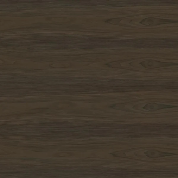
Case
Walnut Ember
Wilsonart 8286-05. A mid-brown walnut, carried across case, shelves, dividers and cabinet doors.
Base
Nero Ingo
FENIX Ultra-Matte J0720. The 4″ recessed base, full width, so the run sits on a shadow rather than a plinth.

Panel
Grigio Aragona
FENIX Ultra-Matte J0793. The panel elements, including the one closing the bay directly above the display.
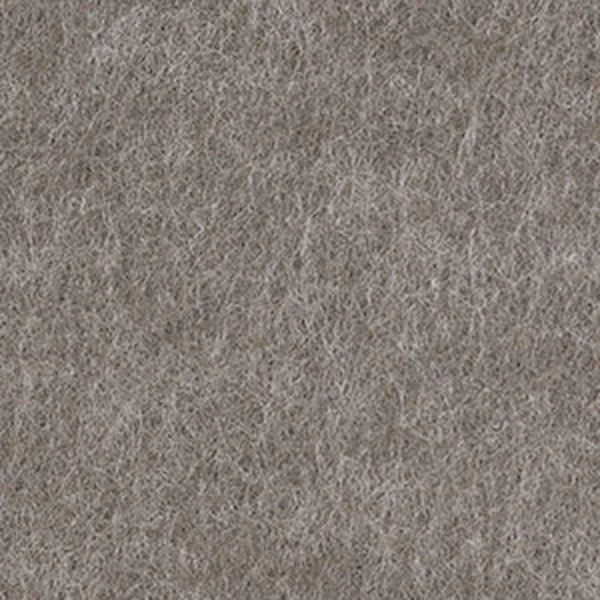
Acoustic panels
City Grey
Plain faced, at the back of the divided bays. Applied to the face of the compartment it closes; the reverse of that panel is Grigio Aragona.
How is the display powered and serviced?
The display column is built for it: the screen is carried on the structure rather than a wall bracket, and the closed bays either side of it take the hardware. Cable routing, outlet location and the mount specification are coordinated per project, so bring your AV consultant's requirements to the specification and they get built in rather than worked around.

Ready when you are.
Media Post loads as a starting point, drawn exactly as it is on this page: three columns with the display at column two, four tiers, the four inch base, Walnut Ember with a Nero Ingo base and plain City Grey acoustic panels. Move to a larger screen or turn it landscape and the column widens with it. No login required.
06
Issue
Media Post as a two page design sheet you can drop straight into a package. Dimensions, the schedule row by row, the finish palette, and the drawing.
Joynn’d
Storage-Integrated Space Division
Common questions
108 inches wide, 76 inches high and 18 inches deep. The width is three double-width 36 inch columns; the height is four 18 inch tiers over a 4 inch recessed base. Unlike Media Hub, every column is a standard width, because a 32 inch portrait face is only 16 inches across and fits inside a standard module.
Because of what the screen is for. A vertical screen suits what people take in while they are moving past it: a class schedule, a floor directory, room status, a welcome. Landscape suits sitting down to watch something. Orientation is a content decision before it is a furniture one, and the run follows from it.
Forty-two inches of floor. A 43 inch landscape screen is wider than a standard module, so in Media Hub its column builds at 42 inches and the run comes to 150. A portrait face is narrow by definition: a 32 inch screen upright measures 16 inches across, drops into a 36 inch module, three columns come to 108, and nothing about the case has to change to hold it.
So the run does not read as a wall. A nine foot run with a screen in the middle of it is close to being one, and a single clear opening at the bottom of the center column lets you see floor and the room beyond directly under the display. It is the bay that proves the piece is a boundary rather than a barrier.
Yes. Media Post is freestanding and double sided, with compartments specified independently per face. The display is the one element that serves a single face: it presents a panel to the far side, which is the trade a screen makes in a divider. Every other bay reads through, is backed, or is doored, per face.
No. It is a starting point. Column count, tier layout, screen size and orientation, which bays carry acoustic panels, the base type and every finish can change. Build it in the configurator to see the specification update as you go, or download the design sheet for the version drawn here.
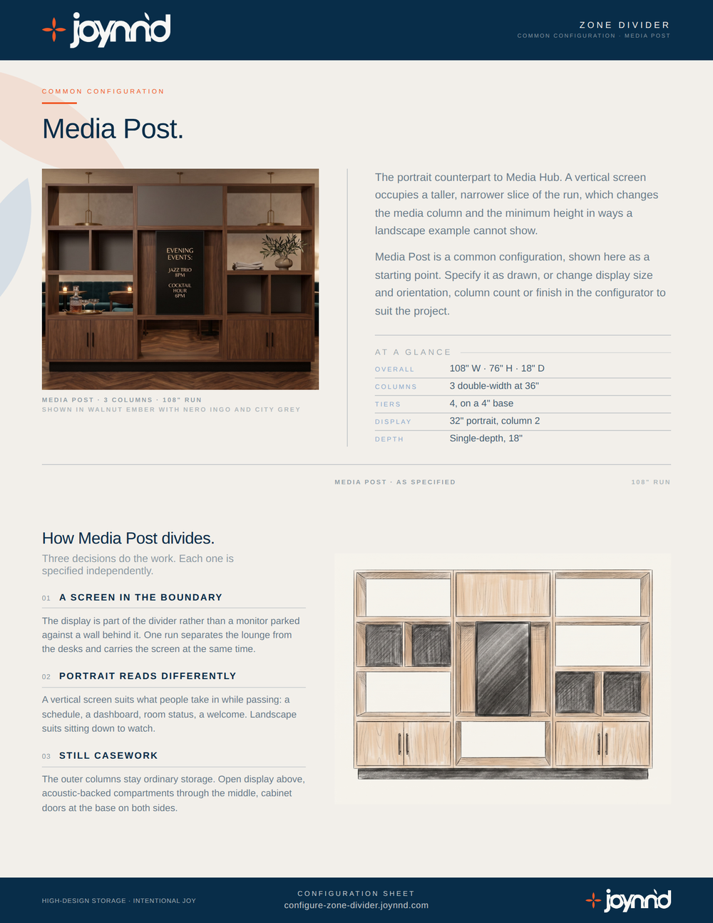
Common Configuration
Dimensions, base and column options, acoustic panel colors, and the full finish palette, one document for any project.
We respect your information. No spam, ever.
Your Media Post design sheet is on its way. We'll send a copy to your inbox.