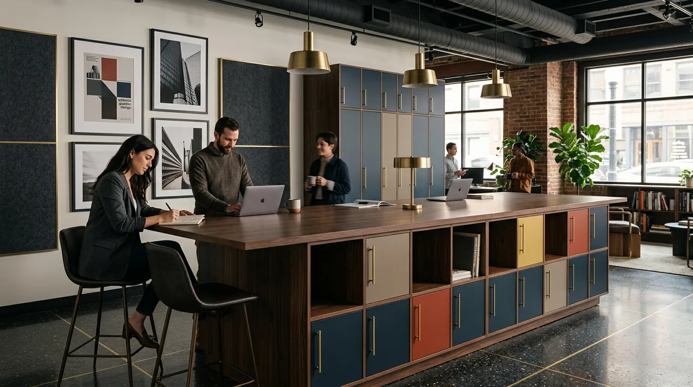
The Joy Collection
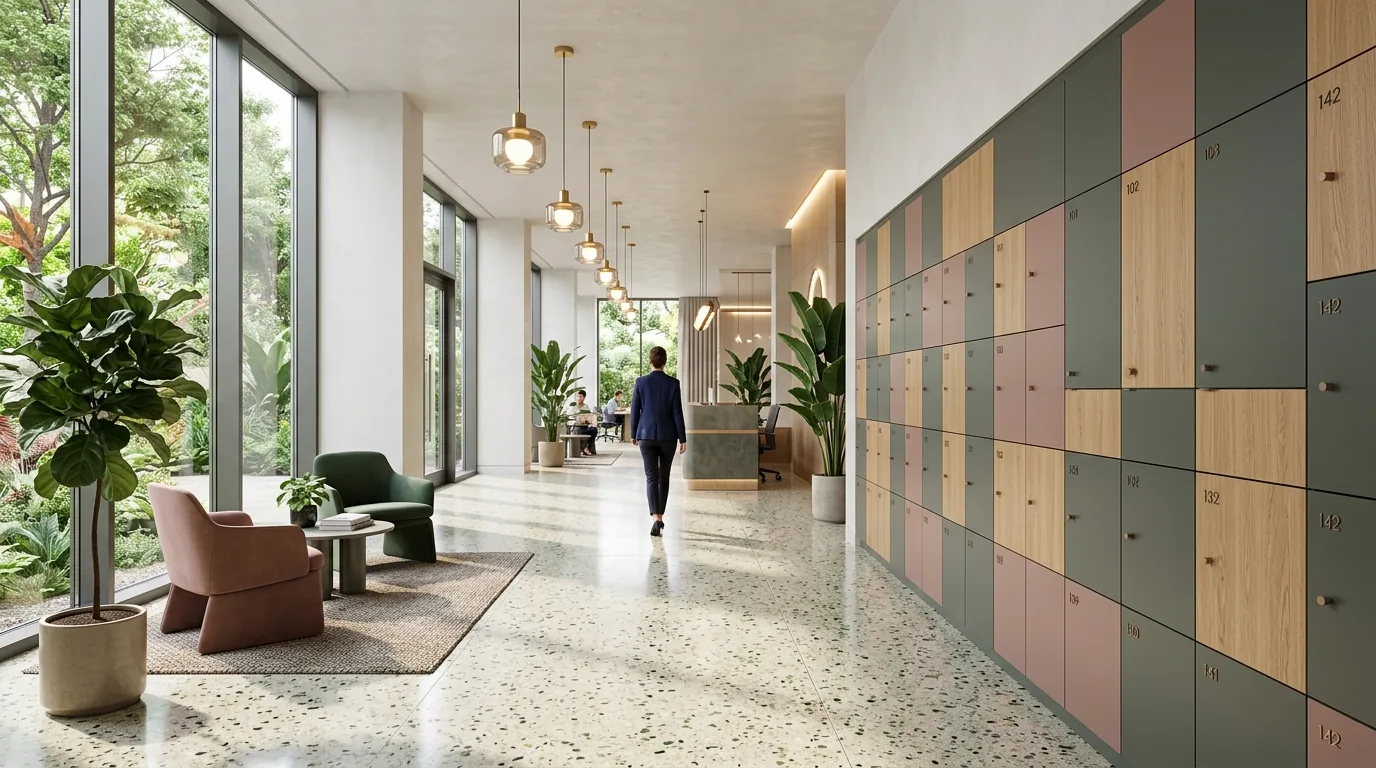
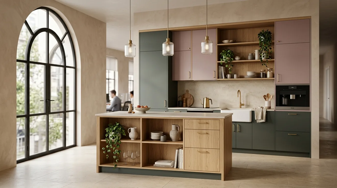
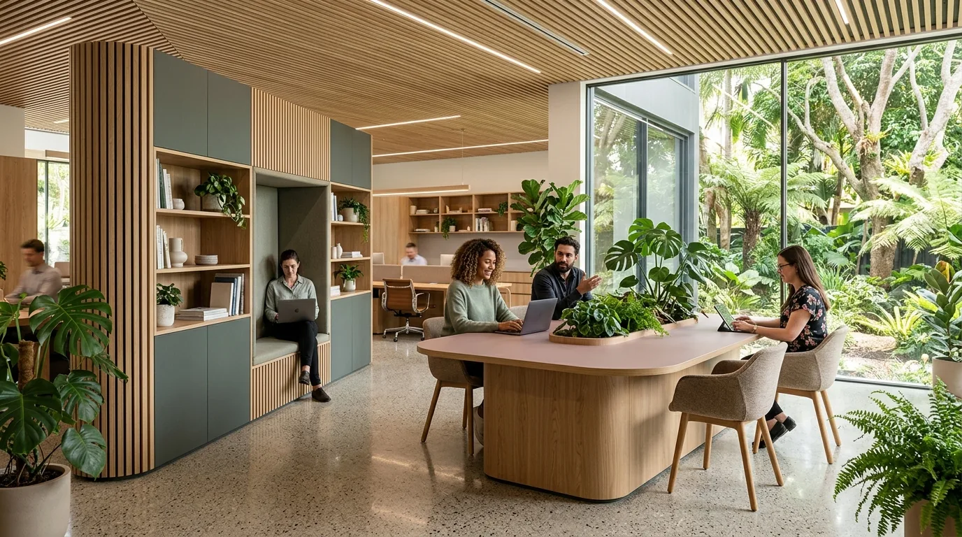
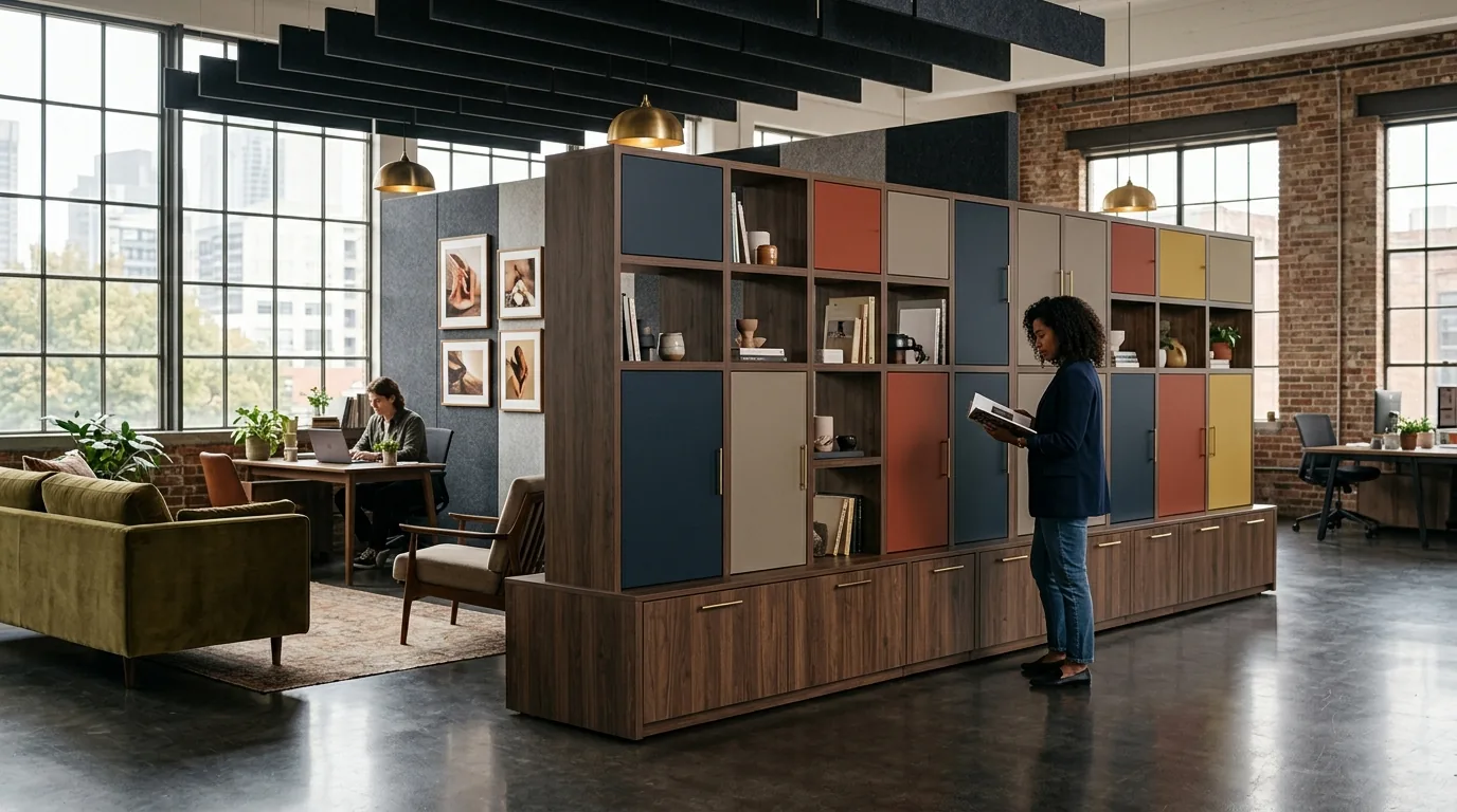
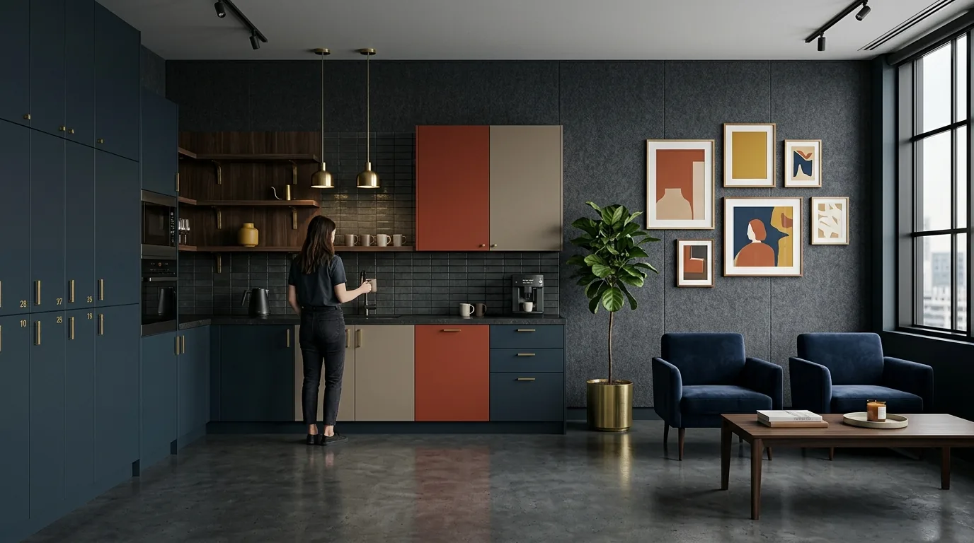
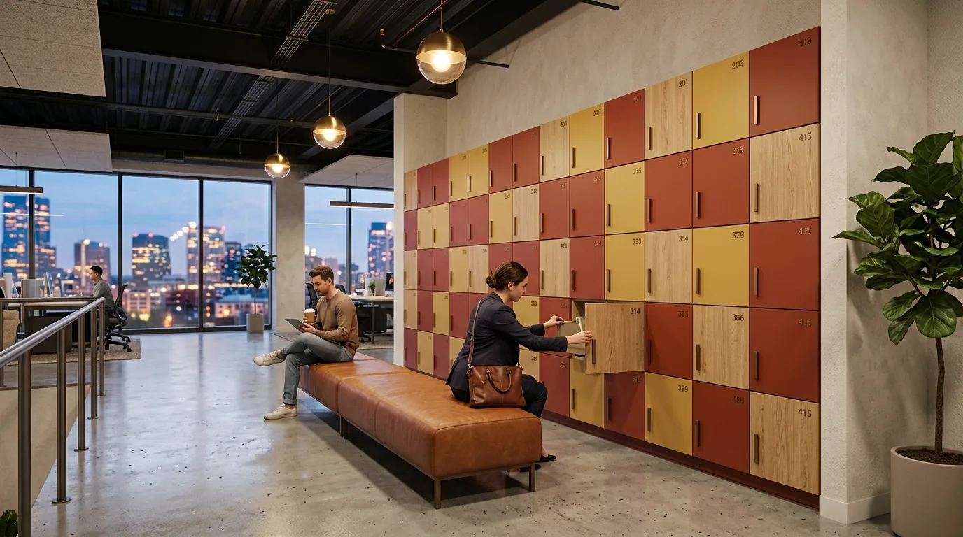
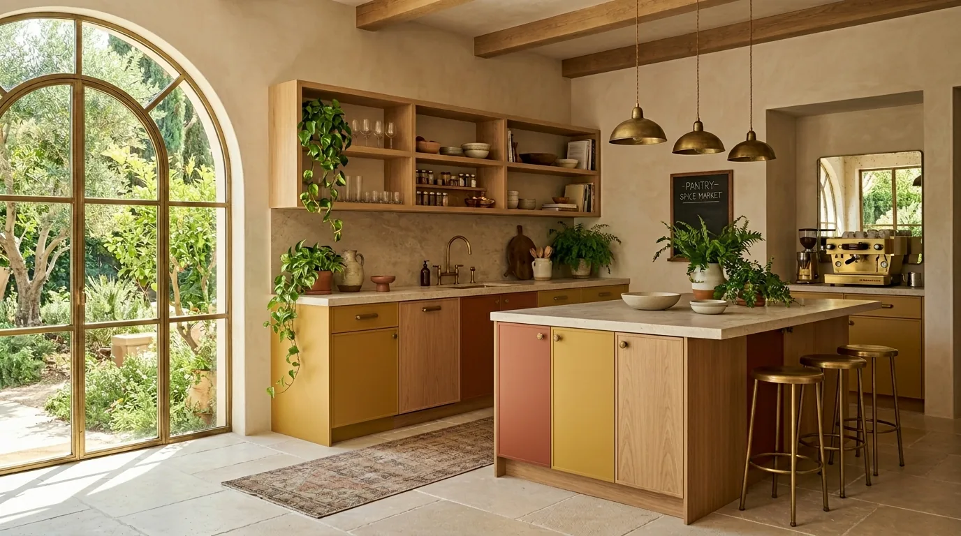
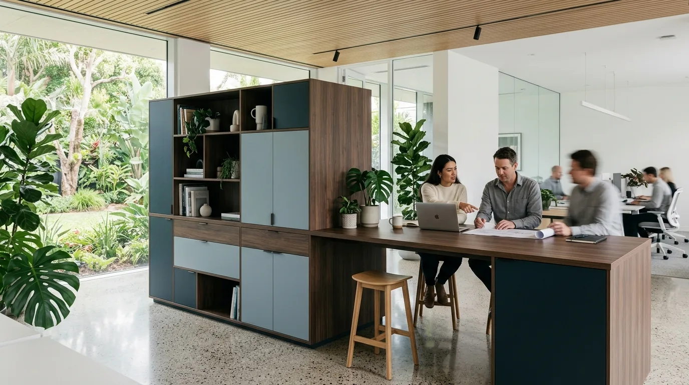
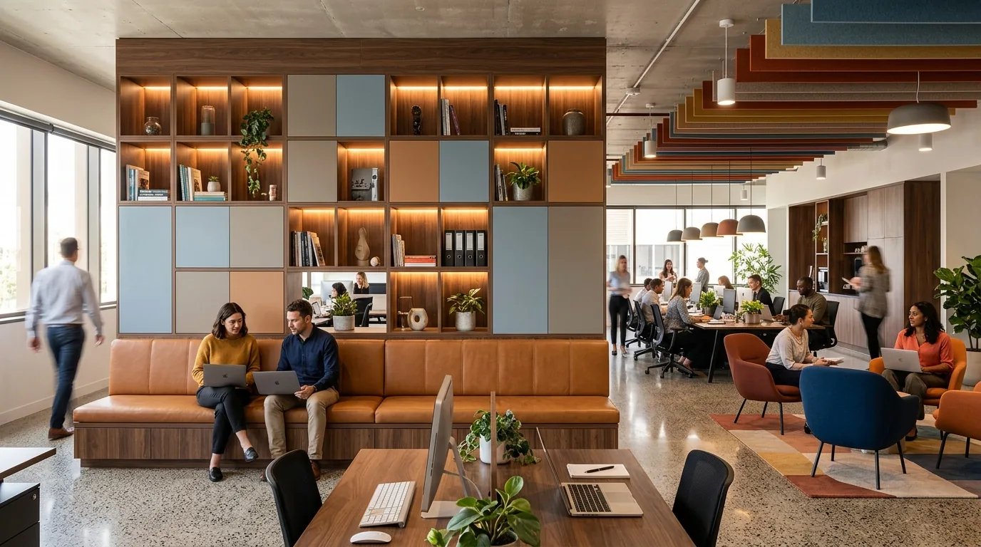
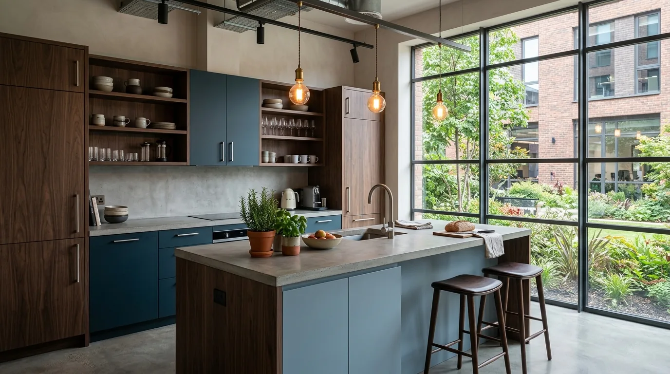
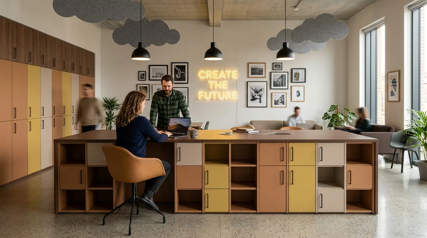
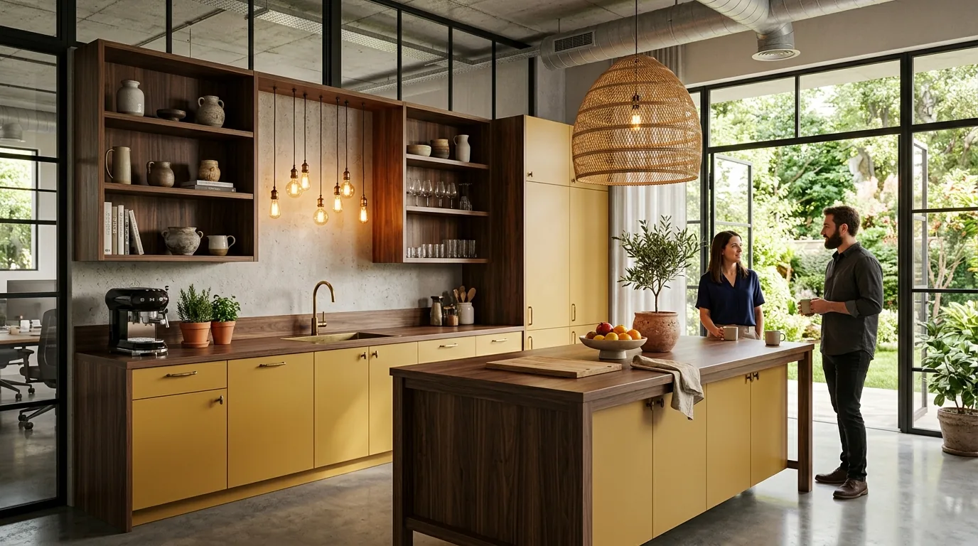
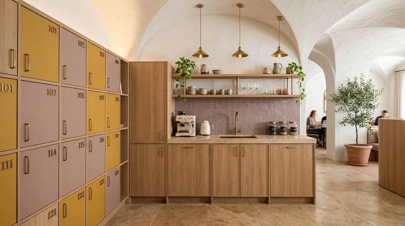
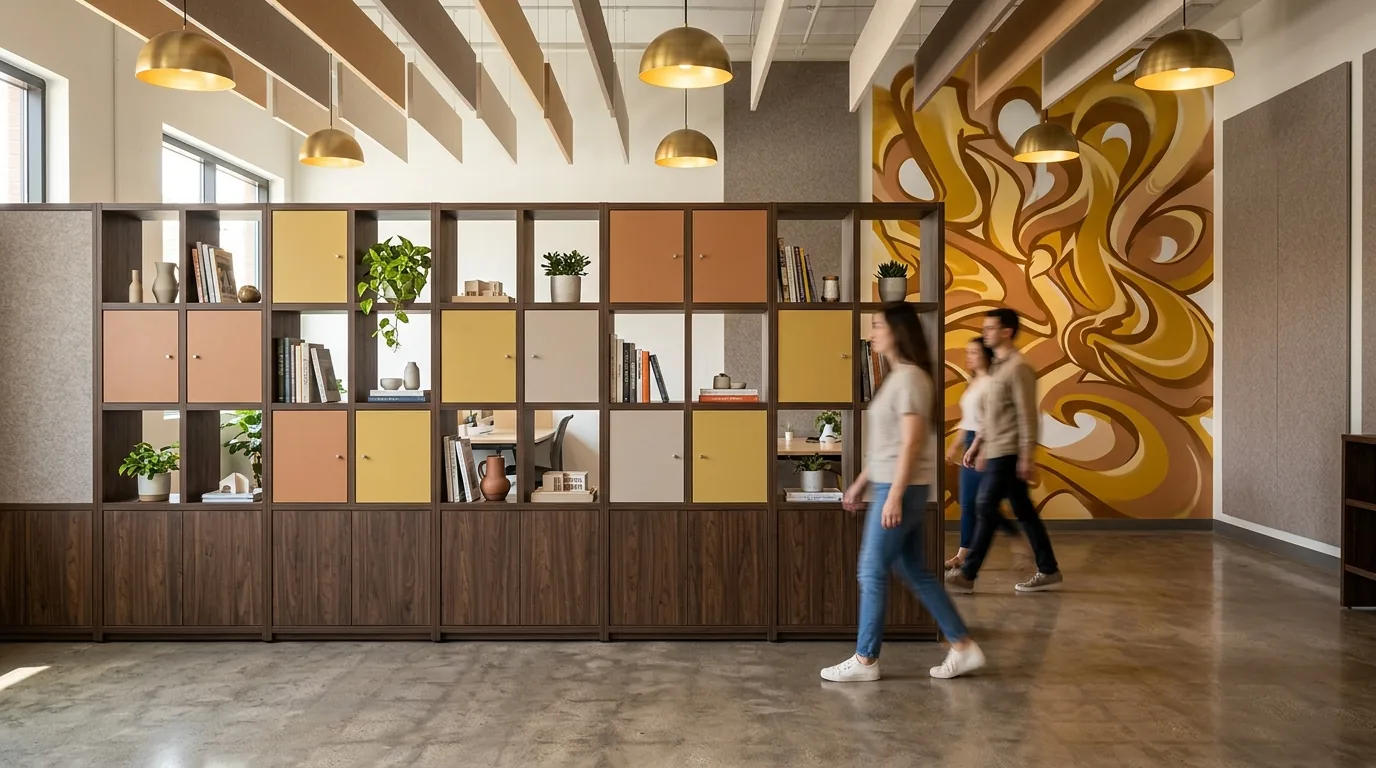
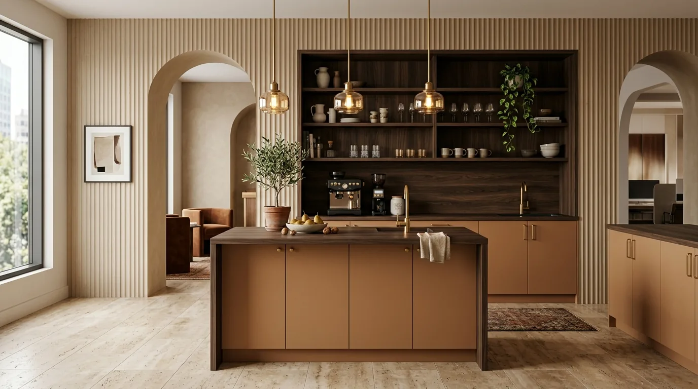
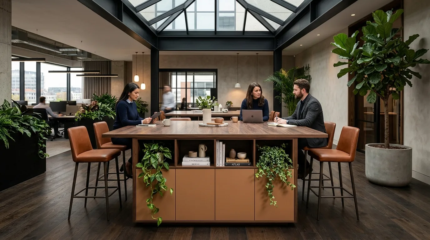
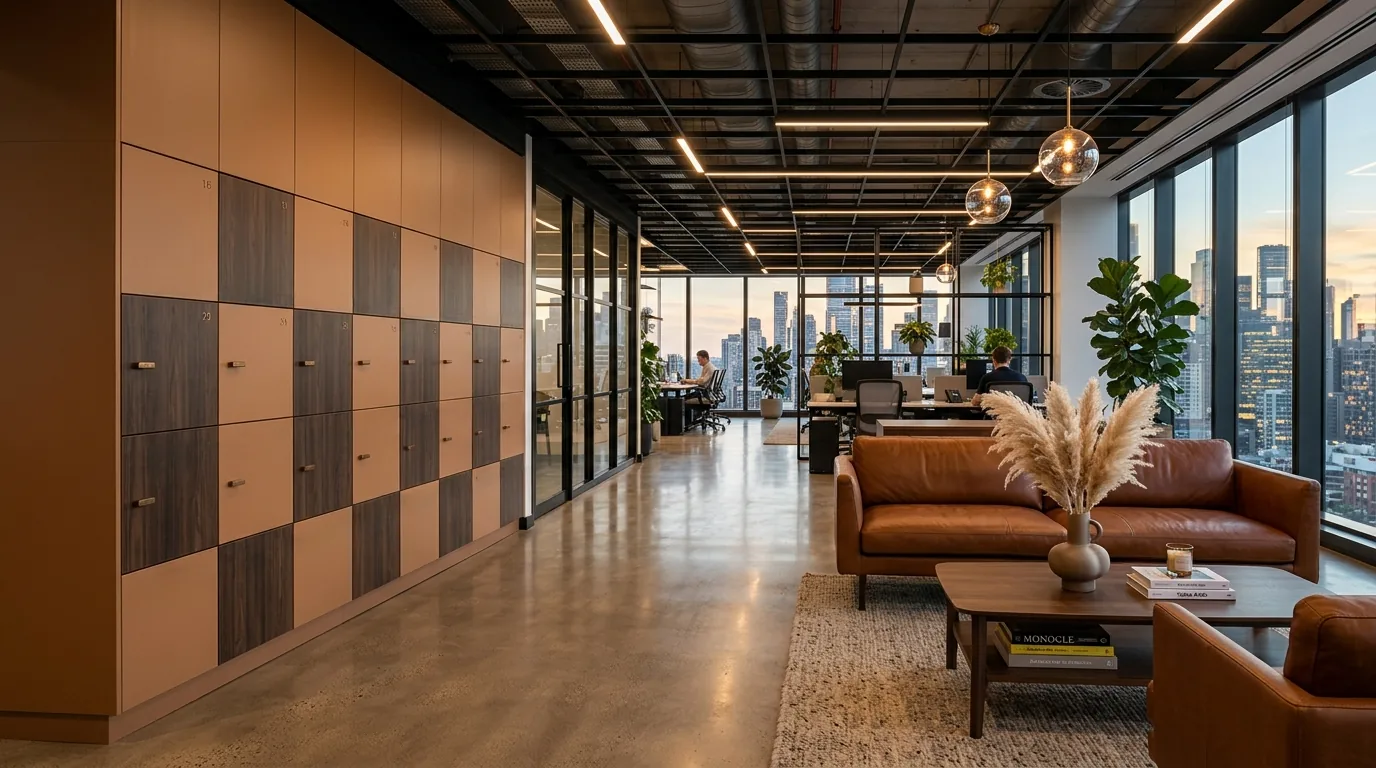
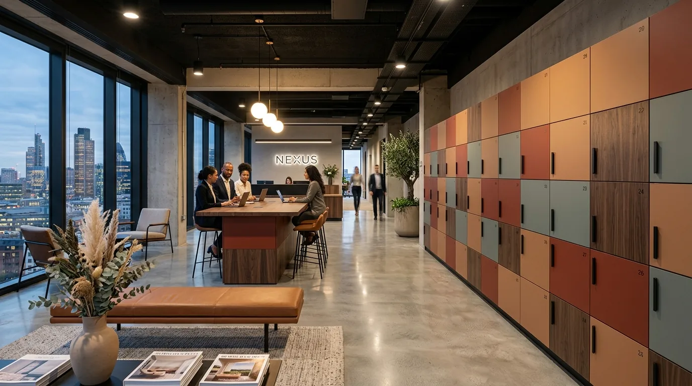
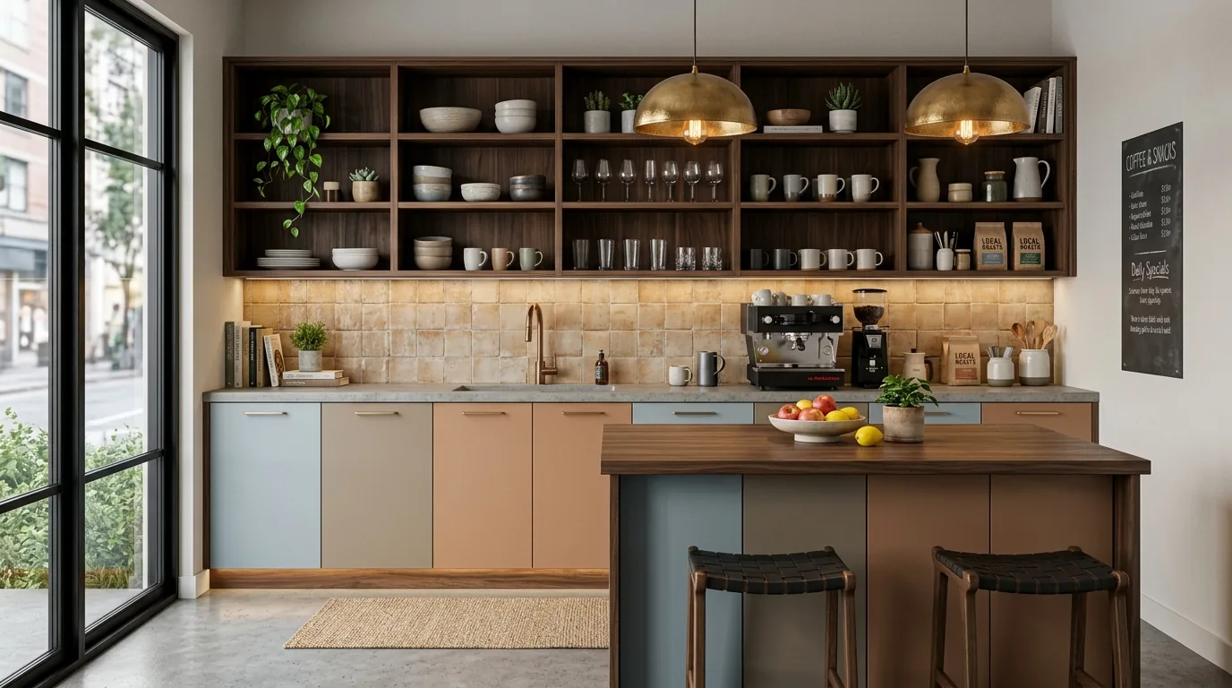
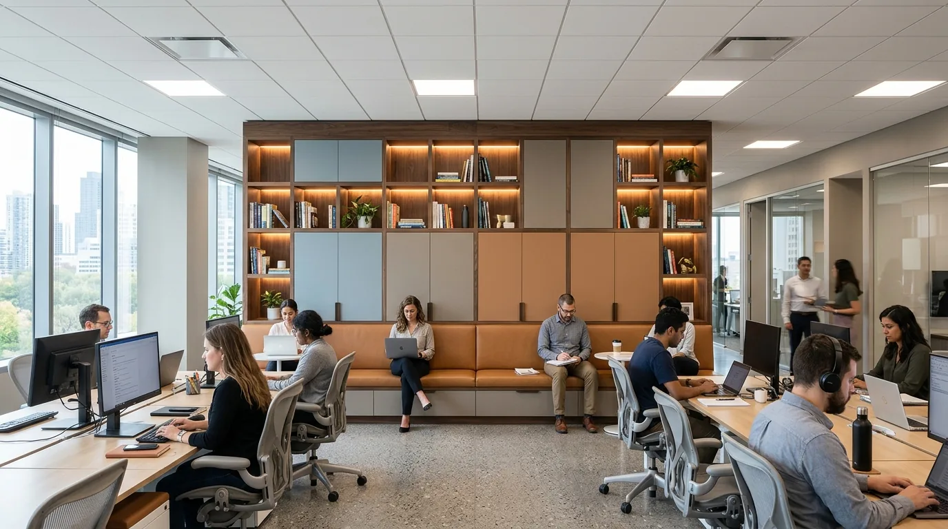
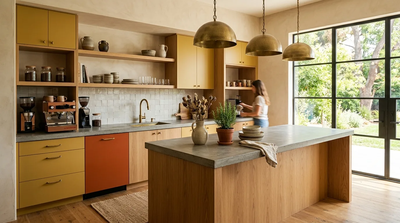
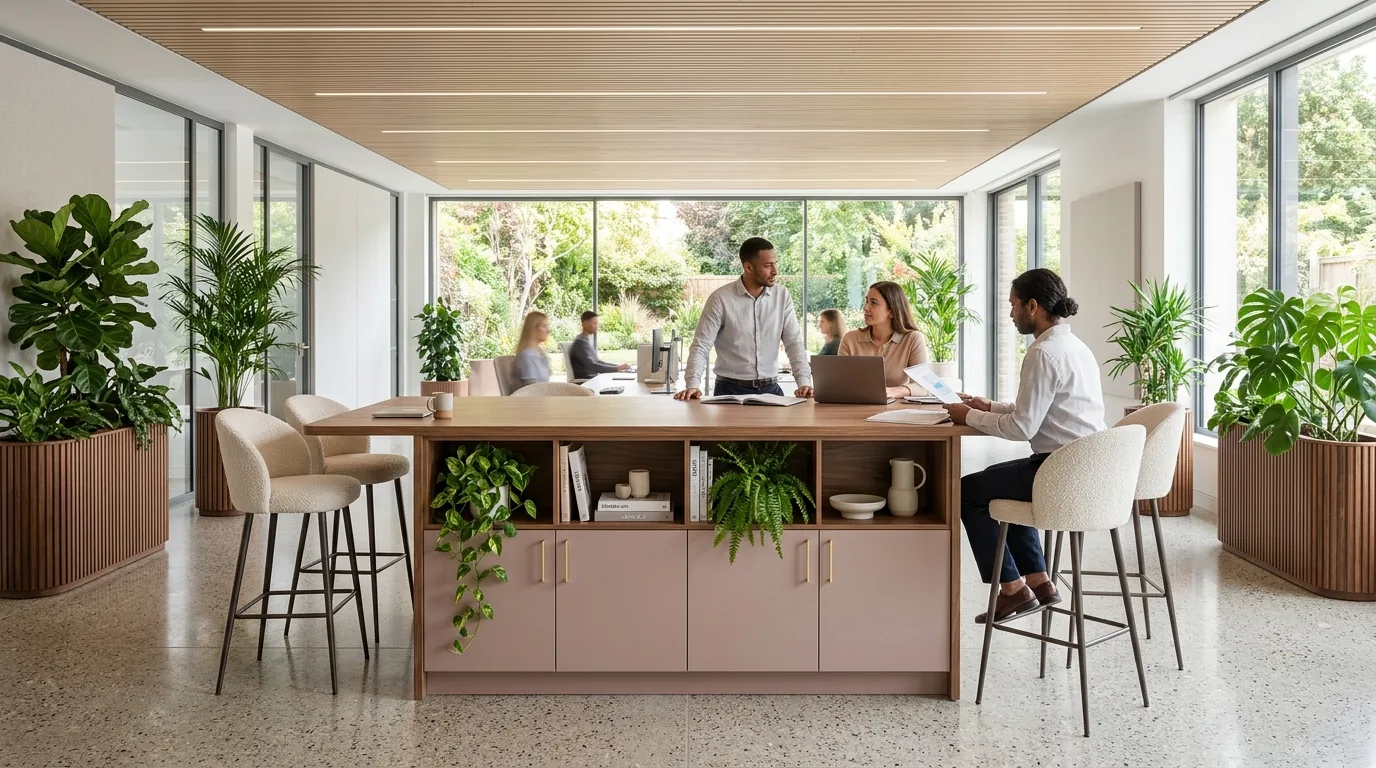
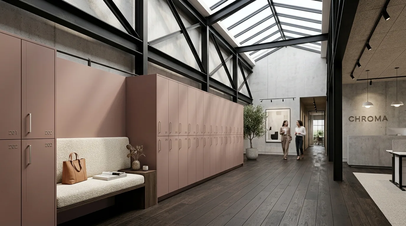
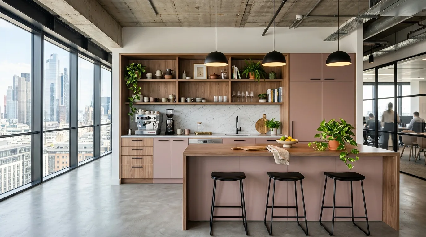
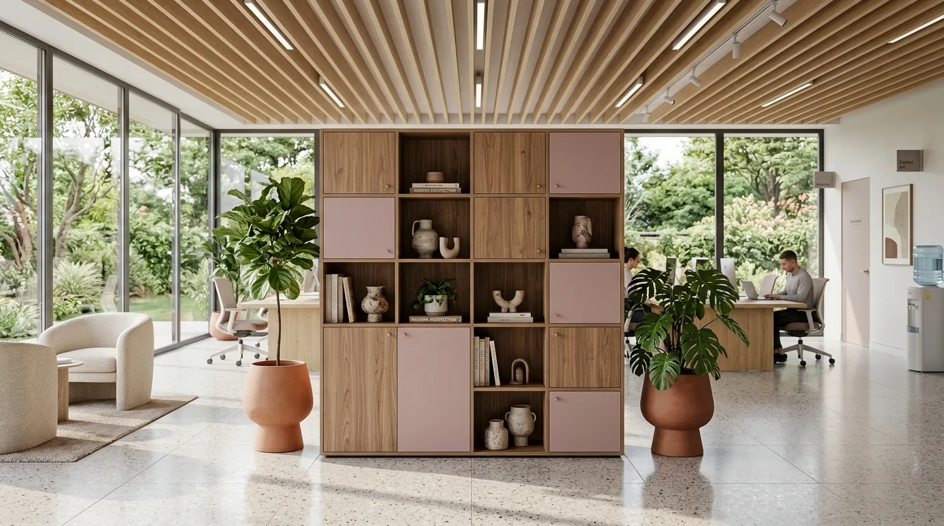
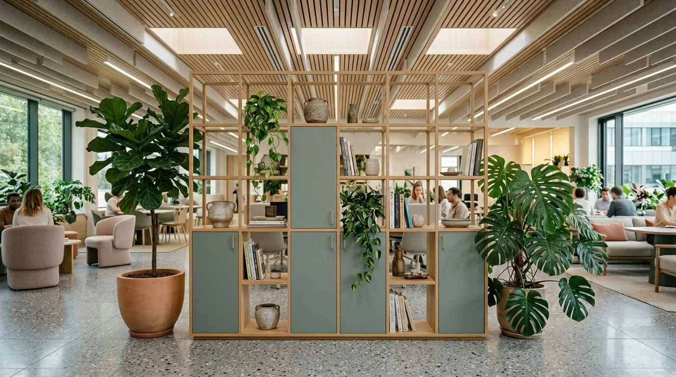
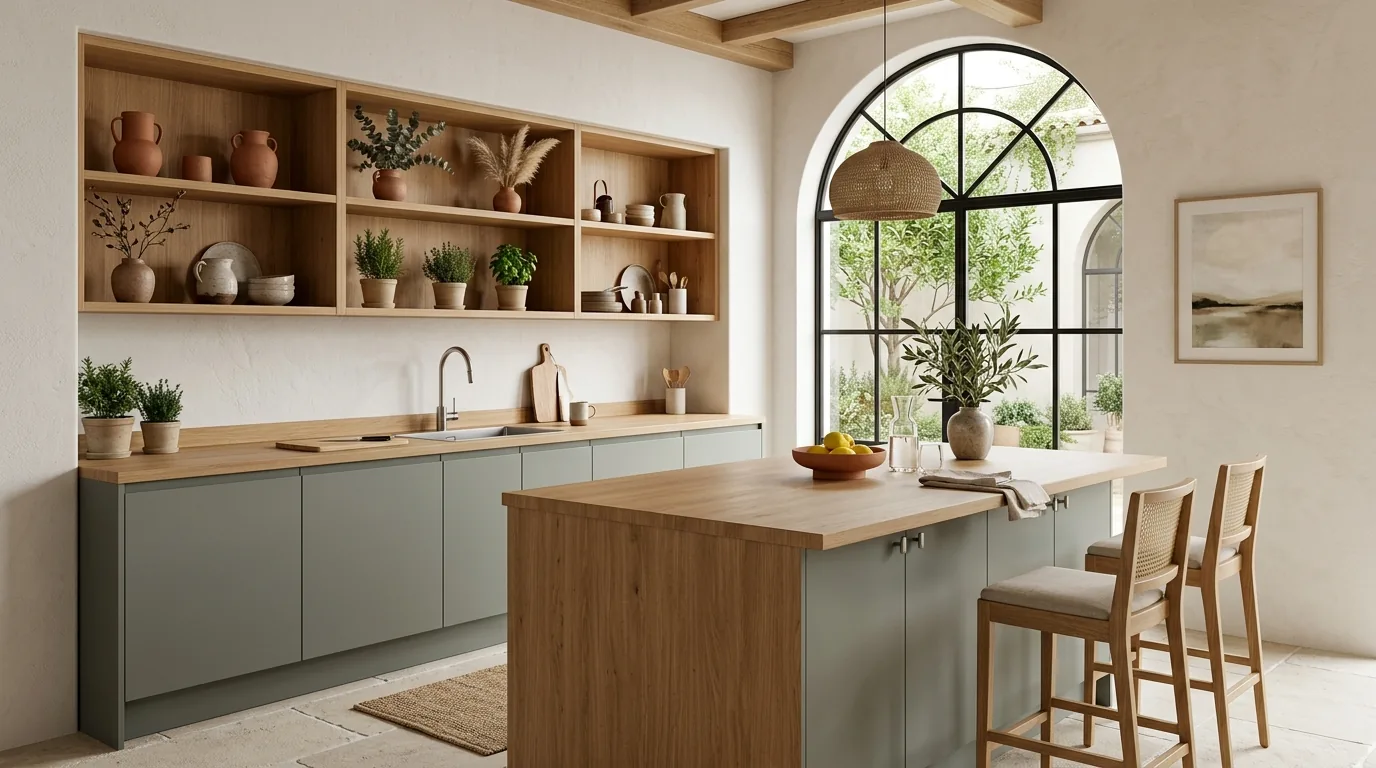
Color at Joynn'd is not a finish option. It's the product.
Chosen the way a painter chooses.
They hold the room without competing for it.
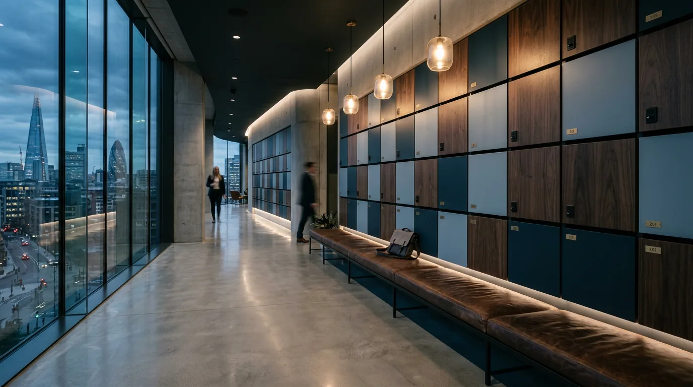
Dark teal-green with real presence. Rosa Viola adds warmth without going soft.
A pairing that earns its authority without announcing it.


It turns emotional.
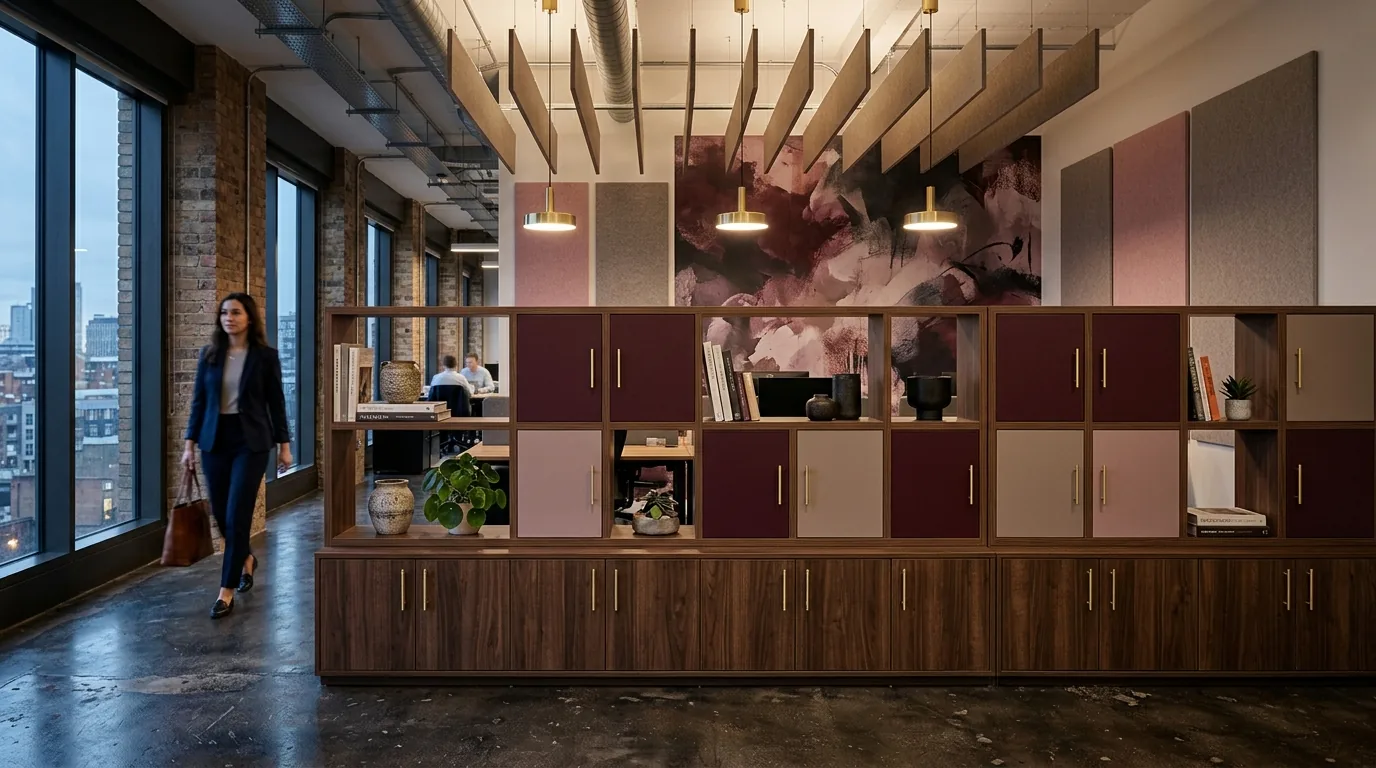
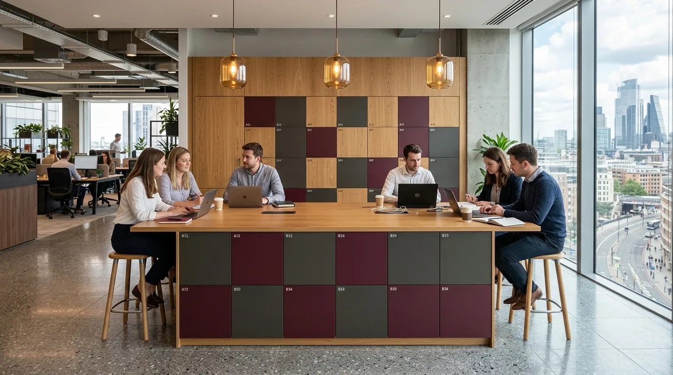
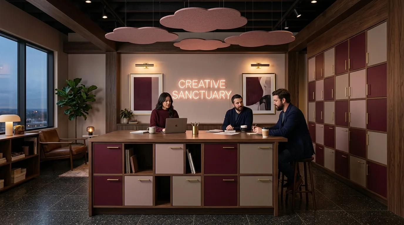
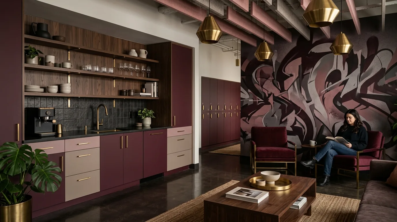
Deep burgundy with staying power. With dusty rose and warm grey
it pulls inward. Rich, personal, layered.
It goes somewhere quieter.
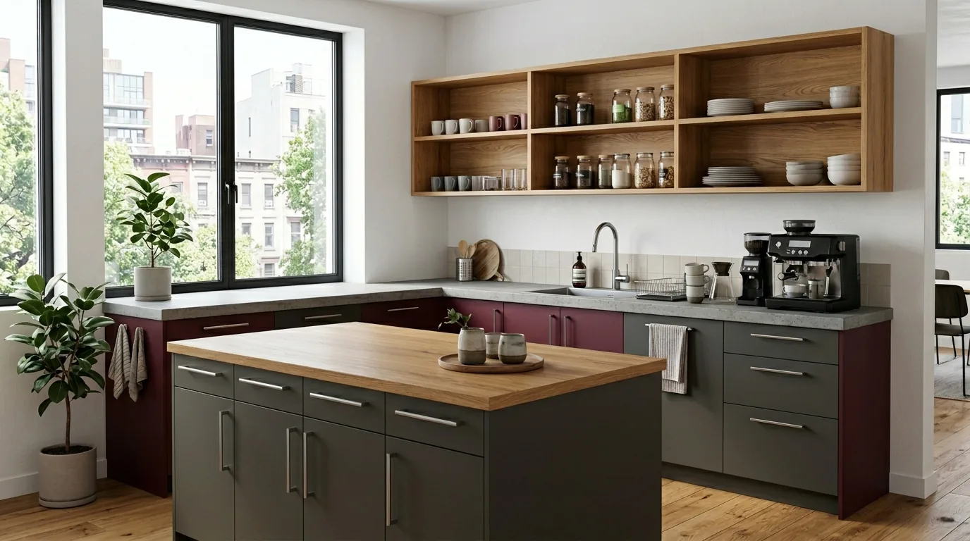
Against dark charcoal, no warmth to soften it.
More deliberate. More architectural.


It holds its edges.
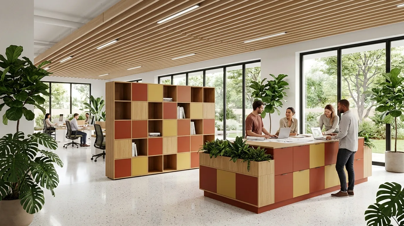
Deep rust flanked by navy and gold — nothing accidental about it.
Antrim keeps it from going precious. Fairchild grounds it.
It loosens up.
Rosso and India run hot together. White Oak pulls it back to earth.
Same strength, warmer footing.


It disappeared into navy.
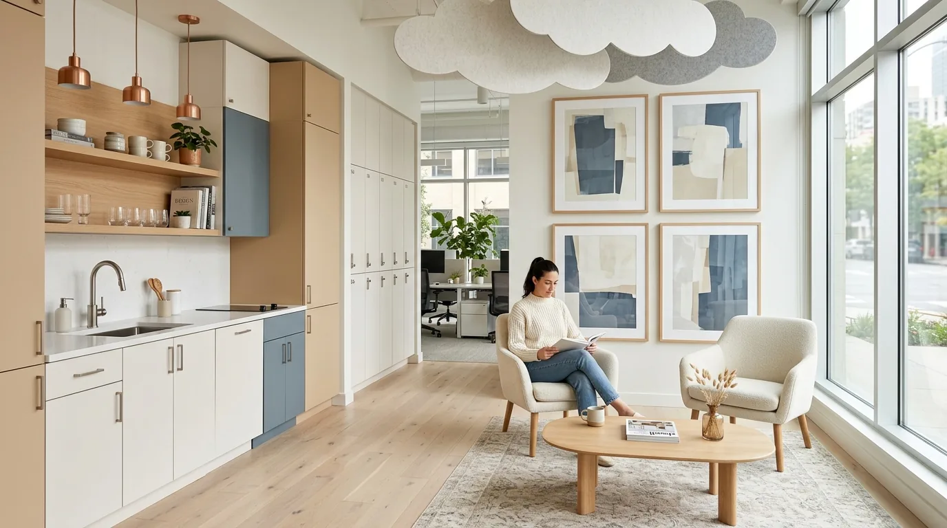
Two blues that share almost no undertone. Bleu Spazio is airy and receding. Blu Shaba is weighted and deep. Together they feel architectural — like a building that earns the sky.
It almost disappears.
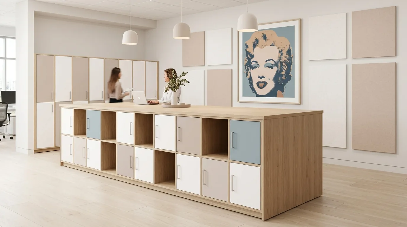
With Bianco and Beige it almost disappears — softly present, barely there. White Oak Wheaton gives it something warm to rest against without competing.
It gets a backbone.
With Cappuccino and Grigio Medio, Bleu Spazio finds weight. Cherry Sienna gives the palette depth. The same quiet color — now serious.


It warms without burning.
Cappuccino brings richness without competition. Grigio Efeso keeps it light. Walnut Ember ties the palette to something material — warm, specific, grounded.
It softens.
With Rosa Viola and Cherry Sienna, India loses its edge. The palette goes golden, dusty, personal — the most unexpectedly soft version of a warm color.
Two demanding warms.
With Rosso Namib and White Oak, India holds its heat. Two demanding warms that earn each other. White Oak keeps it honest. India never loses itself.


The grain is enough.
Columbian Walnut sets the tone. Rich, warm, specific. When the wood is this good, color can wait.
Hot, cool, grounded.
Rosso runs hot. Bleu Spazio cools it. Cappuccino holds the warmth between them. Columbian Walnut anchors the whole thing — a palette that earns every decision.
Cool lands soft.
Bleu Spazio cools it; Grigio Medio grounds it. Together they shift Cappuccino from warm to composed — the same richness, a different room.


Dusty meets earthy.
Rosa Viola against Brazilwood. Both muted, both warm, both nuanced. The kind of palette that looks like it wasn't designed — it just happened.
It goes golden.
With India and Cherry Sienna, Rosa Viola goes golden — warm, personal, soft. A whisper between two louder colors. The dusty pink version of a sun-warmed afternoon.
It goes deep.
With Viola Tramonto and Grigio Medio it goes deep — interior, moody, specific. Columbian Walnut holds it together. The same quiet color. A completely different room.


The deep anchor.
Rosso and India sit warm against Blu Shaba's cool depth. The contrast reads architectural — not corporate. Walnut Ember grounds the palette in something material.
It goes cool.
Bleu Spazio and Fairchild pull Blu Shaba toward something quieter. Two cool tones, one deep — restrained, tonal, precise.


The Lookbook
Check your inbox — the Joy Collection lookbook is on its way to you.